Here's a compilation I made of my favorite logos for some of the finalists, utilizing the generic HC logo colors which I would almost guarantee are brought forward to the final design (not that they won't also add a pop of a third or fourth accent color).
Many of the AI concepts are slick but WAY too busy for a hockey sweater or modern logo. I think like
@rt has mentioned, if the graphic design/branding company that Smith hired is known for simpler, modern logos - then some of these fit that profile of "would they look clean and clear on a hockey sweater during a game".
I'm also not a fan of logos where it's like "HEY ADD CROSSING HOCKEY STICKS BEHIND THE LOGO SO PEOPLE KNOW IT'S HOCKEY".
Outlaws Logo: By
@rt from AI - recolored. I think if they do Outlaws they will lean into something "western" like this as opposed to actually having some hockey-masked "bad guy".
Yeti Logo: From thefaceoff.net - not sure by whom - recolored. Love the incorporation of the "U" and one of the few Yeti logos I have seen where the Yeti isn't some super weird looking, disproportional face.
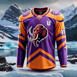
Mammoth Logo: A concept logo not for Utah but just for a Mammoth-themed team by Thomas Hatfield from Dribble - recolored. Simple, bold, stylish and well-proportioned.
Venom Logo: By
@HabsGifs on X (not sure if they created it or were just posting it from elsewhere). One of the few Venom/Viper/Snake themes that doesn't look overly detailed. Slick potential for an interlocking "U & V" secondary here.


 If so, which of the six remaining names conjure up “mountain” branding along with these colors? Mammoth? Yeti? Blizzard?